Email Signatures
Use these email signature guidelines to present a more unified, professional appearance for official University communications.
These are recommended for all faculty and staff.
Create your own SFSU Email Signature
- Download the SFSU Email Signature Template
- Copy all information from options 1, 2 or 3 (artwork and contact information) to your clipboard.
- Paste signature into your Outlook signature settings
- Update your personal contact details before saving to your outlook signature.
Do's and Dont's
- Do keep it simple. Include only essential information in three to eight lines.
- Do use Arial, sized 10-12 points.
- You can include simple URLS (without “http://www”).
- Social media links in plain text (without icons) are optional.
- If you’d like, do include your preferred pronouns and name pronunciation.
- Don’t include alternate logos or graphics.
- Don’t include digital contact cards; they increase file size and appear as attachments.
- Don’t include tag lines or quotes; they may be perceived as university-wide statements.
- Don’t include a street address unless you frequently host visitors.
Minimal Signature
John Smith
Assistant Director of Email Guidelines
Strategic Marketing and Communications

Minimal signature example
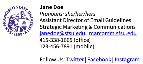
Signature with Multiple Phone Numbers and Links
Jane Doe
Pronouns: she/her/hers
Assistant Director of Email Guidelines
Strategic Marketing & Communications
janedoe@sfsu.edu | marcomm.sfsu.edu
415-338-1665 (office)
123-456-7891 (mobile)
Follow Us: Twitter | Facebook | Instagram

Signature with multiple phone numbers and links example
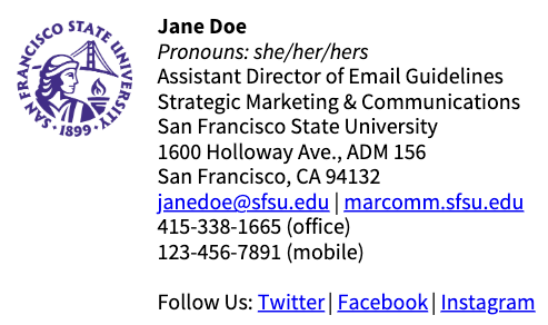
Signature with Mailing Address
Jane Doe
Pronouns: she/her/hers
Assistant Director of Email Guidelines
Strategic Marketing & Communications
San Francisco State University
1600 Holloway Ave., ADM 156
San Francisco, CA 94132
janedoe@sfsu.edu | marcomm.sfsu.edu
415-338-1665 (office)
123-456-7891 (mobile)

Signature with mailing address example
Email Best Practices
HTML Email Tips
- Use static table-based layouts
- Keep template width to 600px or 680px
- Use simple, inline CSS
- Images need to be uploaded to your own website and referenced back to BlackBoard Connect
- Always resize your image to the exact dimensions as displayed in your email
- Do not use:
- Background images
- Custom fonts
- Embedded CSS
- Javascript
- Iframes
- <div>
Subject Line
- Be descriptive
- Keep it short
Content Guide
- Focus on your key message
- The most effective email has one clear message. Consider multiple emails or a series if you have multiple messages.
- Keep it short
- Always reduce the length of your email to be as simple as possible. Most people spend less than 15 seconds reading an email
- Be strategic with your content
- The most important information should appear at the top
- Read More
- If you have too much information, link to a page on your website where your audience can read more
Proofing and Review
- Don't forget to proof your content and your design. Using a spellchecker on word can catch many common mistakes
- Check all links for validity
- Send a test email to yourself
- Test the email in different email clients
- See how it looks on a mobile device